Conception
For the concept of the website, I thought about the demands in the perspective of Buffire and their customers. In addition, I looked at their competition and checked out, how they present them selfs.
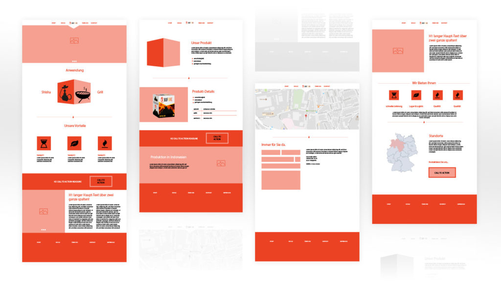
With that, I started to bring all needed sections together and include them into a concept with 4 main pages which I’m explaining here.
Start
Attract the visitor and give him short information about the different use-cases and benefits of the product. In addition, a small information about the company should establish trust and interest in the new brand.
Products
Offers detailed Information about the Products and quality standards of the manufacturing.
About
Introduce the visitor to the company and tells him about their values and goals. Furthermore, it informs the potential customer about the benefits of working with the Buffire and visualize the operating area.
Contact
Provides the visitor with a contact form and offers additional contact information such as the location or a telephone number.
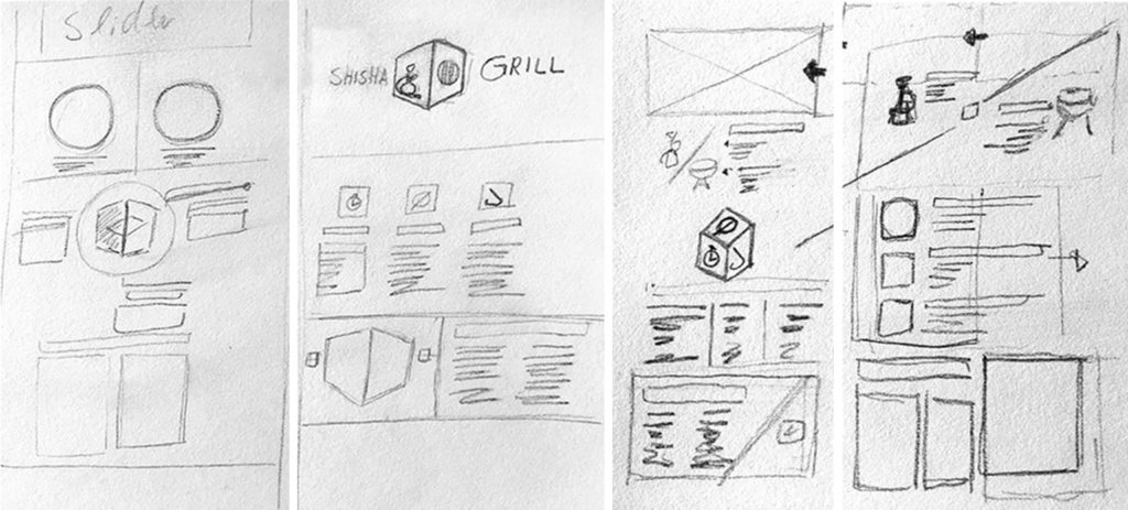
To visualize the different parts, I started to scribble some ideas on paper and check out how the several parts could fit together, in the whole composition.
Visualising the idea via Wireframes
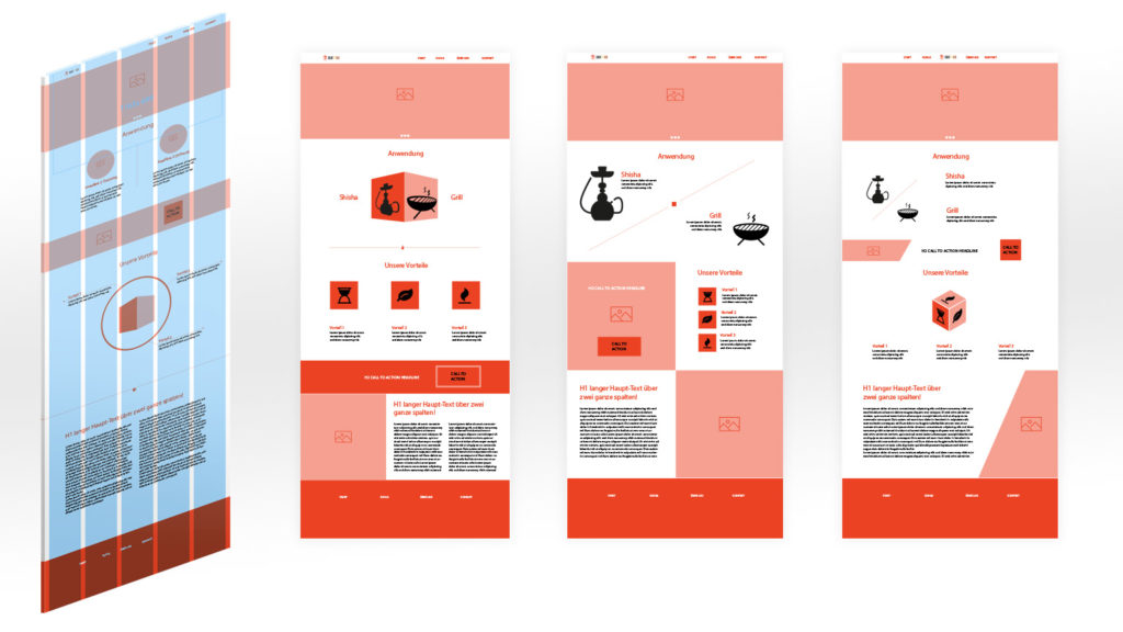
With the concept in my mind, I could now create different wireframes for every main page.
The Wireframes were made in Adobe Illustrator from scratch. I choose to lay down a 5 column grid with a conservative safe area as a base. Therefore I created for every page got some alternatives layouts that I then discussed with Buffire.
Here you can see some versions of possibilities that I came up with, for the start page.
These here are the approved wireframes with which, the concept was frozen. They are then used as the base for the actual web design.
Webdesign and visual imagery
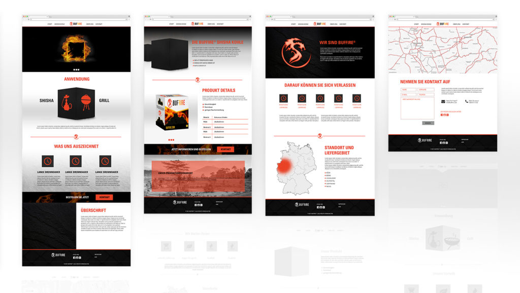
I wanted to create a modern and high-quality look and feel for the website, that represents the good quality of their product, which was very important to Buffire.
Therefore I created a clean layout, with a reduced color palette of white, red and black and a mix of clean areas and subtle use of textures, that provide the layout with more depth.
As the main font, I chose the Universe font family. Especially with a black and condensed font face, as used in the headlines, this font provides the whole design with a strong and modern feeling.
In general, I made sure to include a bunch of negative space to let the content breath.
Buffire didn’t hade a lot of content that I could include in my designs, accordingly I needed to create it the necessary imagery on my own. Here I wanted to create strong and intense images that speak directly to the customer.
Responsive Web-Development with WordPress
With the approved web design, I was able to turn the static images into a real website.
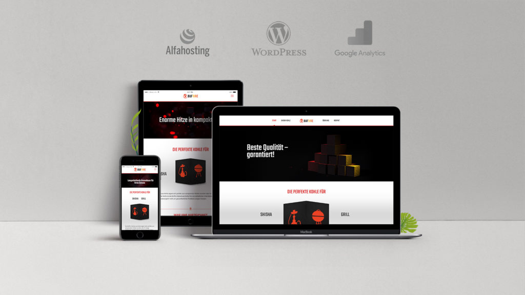
For that, I ordered and managed the web hosting on my favorite web hoster alfahosting.
After I installed WordPress I went further with the implementation and chose an appropriate WordPress theme as the base for my design, which I then adjust and manipulate to my needs.
Even when Initially, I set up my design for wide screens I made sure to programme the site in a flexible way, so that it would be easier to optimize the content for the different smaller screens of phones and tablets.
After everything was set-up right, I created a google analytics account and facebook fanpage and connected everything to the website.
Additional key visuals
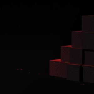
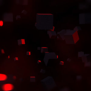
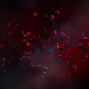
As a new startup, Buffire doesn’t have a lot of image content that I can use in my designs. So I decided to create my own, which I then could use in the main slider and on the facebook fanpage.
Therefore I create these 3D renderings in Maya, where I used the Mash tool and the Arnold renderer for the basic rendering. These were then composed and finalized in Photoshop for the final look.
Project Description
The startup HAE Trading GmbH asked me for a website and help in setting up a facebook fanpage, for their new Brand Buffire.
Under the label Buffire, the Company wants to sell high-quality coal, that is made of coconut shells.
Therefore I created the concept and the design of the website and was responsible for the realization of their website.
- Project-Type: Concept, Web Design, Web Development, 3D, UX/UI
- Tools WordPress, HTML 5 & CSS 3, Illustrator, Photoshop, Google Analytics, Maya
- Project Year 2017
