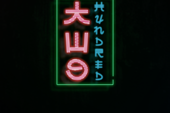
The last days I focused on improving my design skills since I feel I went too far on the technology track in the past.
I came across some nice videos of the future with Chris Do, where he gave some great bits of advice and feedback on working with typography and composition. After I got inspired by one of the posters his college did, I went on creating
my own design-zoo version of it.
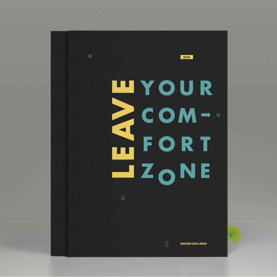
Constraining to one typeface I mainly wanted to control the eye with color and contrast. Some small details add some
visual interest, to this simple composition.
It took me a while finding this result and I throw away a bunch of initial ideas but it was a really interesting journey.

How do you guys like it, any feedback and suggestion to improve are always welcome?
You should definitely check out the YouTube channel of the future. It is simply great and I can really recommend it!
It has a lot of design related content where they cover topics from pricing up to execution.